
Navigation
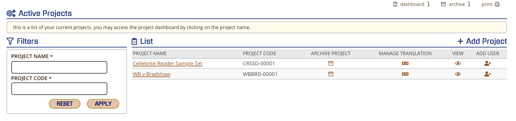
To see a complete list of all your active clients, click on the word "Dashboard" at the top right of your screen.

After selecting one of the clients, you will be able to see a list of all active projects. This list can be filtered by project name or code. To view an individual project, you can click on it's name or on the eye icon designated to that project.
Overview
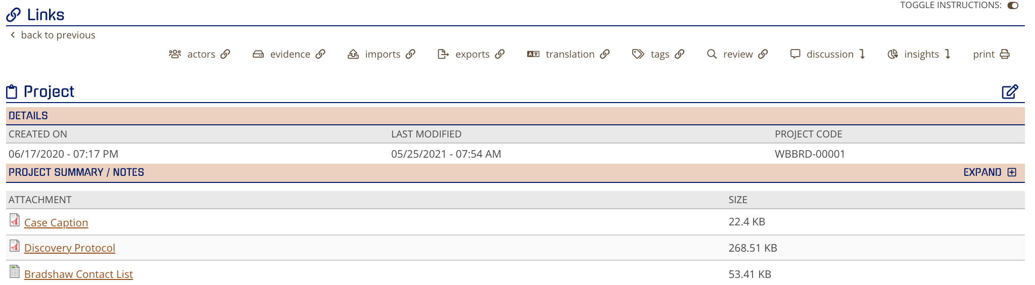
At the top of the project screen, you will see links to lists of all actors, evidence containers, imports, exports, and tags associated with the project. Clicking the translation button will navigate you to logs of the translation progress, detected language, target language, and completion time. The review button will quickly take you to our Review Project Metadata screen (which can also be accessed from the project dashboard). The discussion button will scroll the screen down to show your project's comment section. The project insights button scrolls the screen to the charts underneath the project list.
Distribution Charts
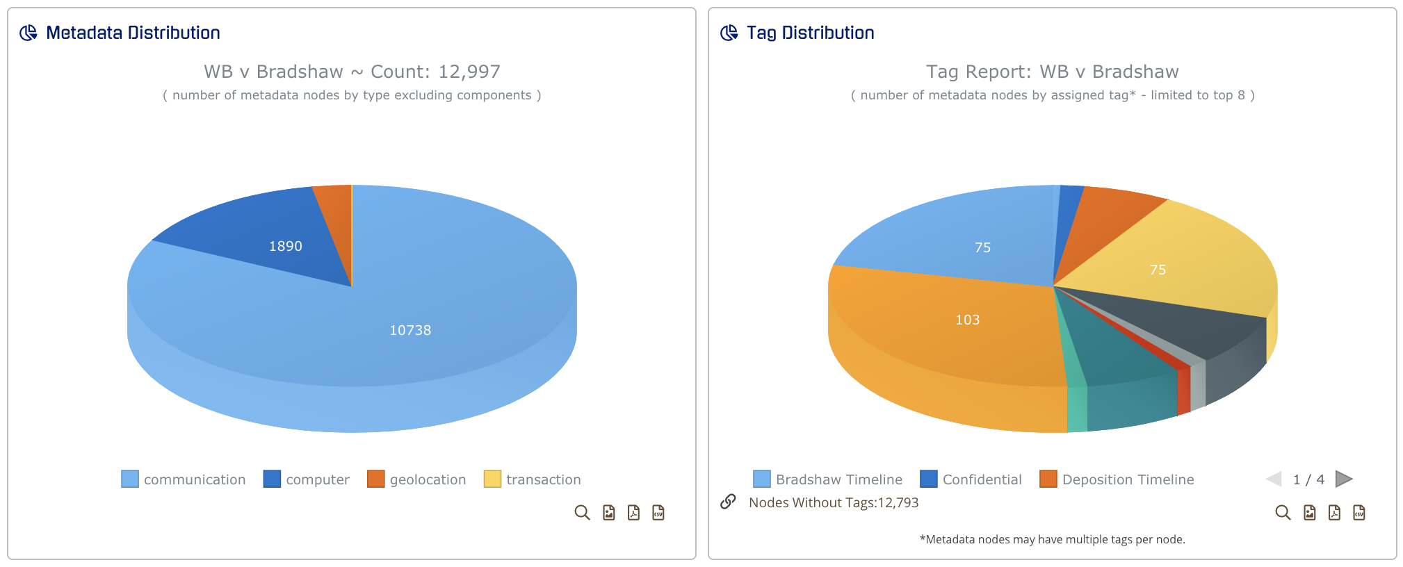
The first two charts show a project's metadata and tag distribution. Hovering over any part of either chart will show statistics on the data type value and percent value. For a deeper examination, you can click on a specific slice to see its accompanying Chronological Item List, or you can click on the magnifying glass at the bottom right of the chart. The magnifying glass will show a zoomed-in version of the whole chart. The icons to the right of the magnifying glass allow you to download the chart as a PNG, PDF, or CV.
Communication Volume By Type
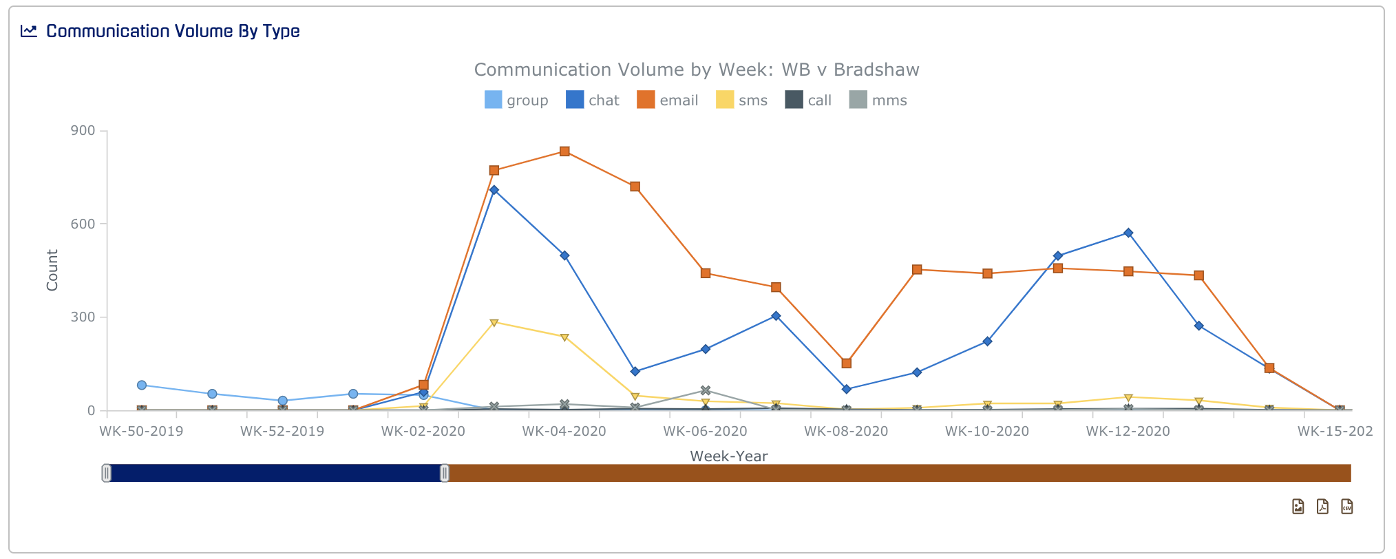
To see a count of various communication types per week, hover over one of the points on the chart. You can also use the slider to adjust the length of the displayed time frame.
Map Points Preview
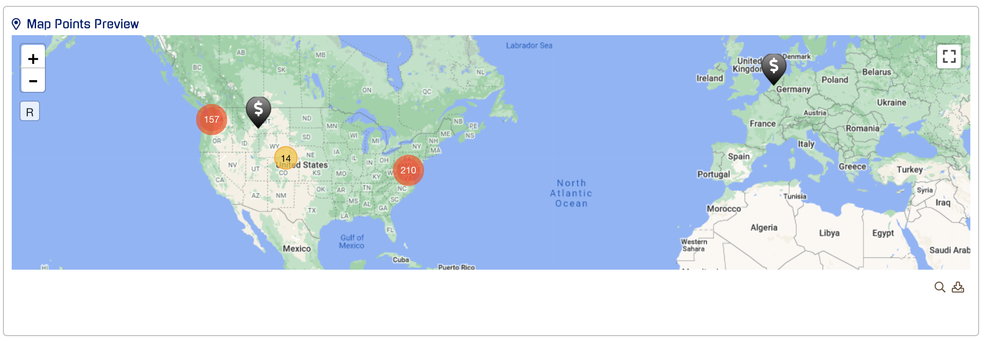
The data from Map Point Preview is divided into clusters. To zoom in on one of the clusters, click on one of the yellow icons. Once you click on a cluster, smaller clusters and icons will appear in nearby locations. You can click and drag to navigate the zoomed-in view or click on the "R" button at the top left corner to reset your map view.
Transactions Summary
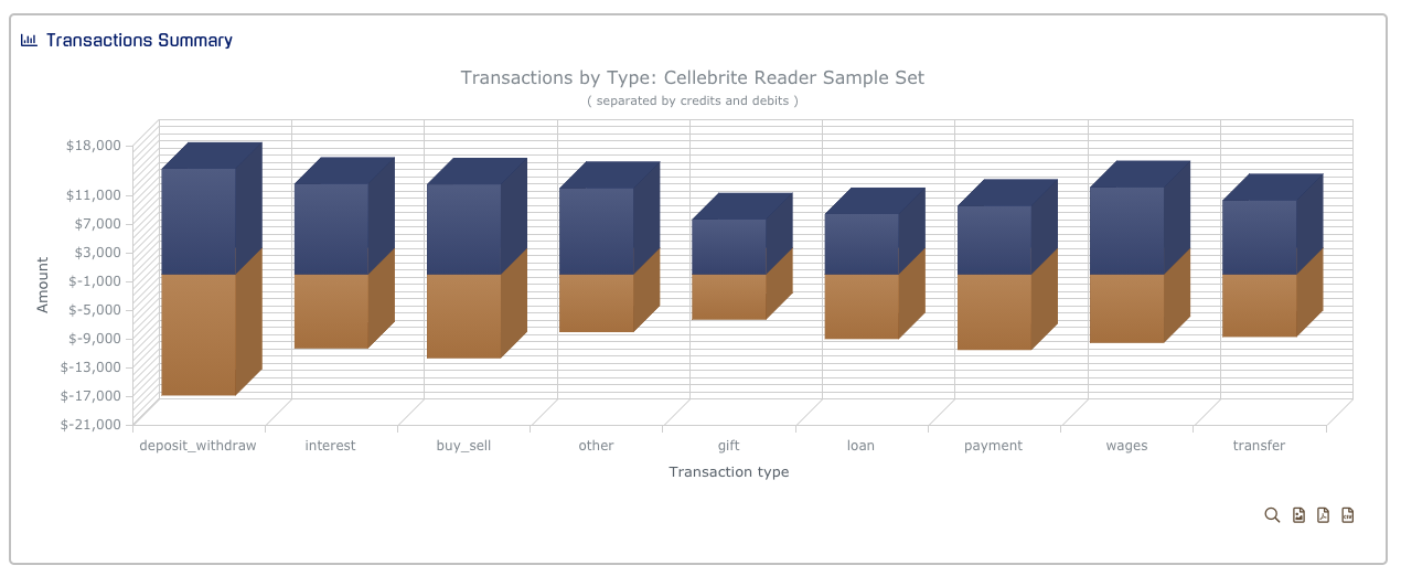
Similar to the Communication Volume By Type chart, you can hover over any bar in the Transaction Summary to see a preview of the information. The blue parts of each bar represent positive transactions while the orange parts represent negative transactions. For a deeper examination of the data, click on one of the bars.
Expanding, Printing, and Saving Charts
For more information, please visit this link: https://support.esianalyst.com/portal/en/kb/articles/expanding-saving-and-printing-charts